Quick and easy mobile optimized websites
- Internet & email address included
- Always up-to-date
- 24/7 customer support

Create a mobile optimized website
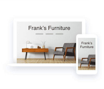
With IONOS MyWebsite, you can create a professional site for both desktop and tablet PCs, as well as an optimized version especially for smartphones.
Why is it important to create a mobile website?
Smartphones, tablets, and other mobile devices are steadily gaining popularity. More and more people use a mobile device to access the internet. It is often quicker to look something up using your smartphone or tablet than to start up your computer. The technology for mobile internet like 3G or LTE is constantly improving too, making surfing the internet on the go an attractive option. As a website owner, it is important to adapt to this trend quickly by creating a mobile version of your page.

Optimized for all devices
Optimized for all devices
Without any further effort on your part, your website is optimized for mobile devices such as smartphones and tablets. Ensure your website makes a perfect impression any time, any place with the mobile website builder.
Design templates
Design templates
Easy to download in just a few clicks, our professional website designs are sure to be a hit. The preview function shows you how your chosen design will look on a desktop PC, tablet and on a smartphone. When you create a mobile web page all our templates are customizable and automatically optimized for all devices.
Device View
Device View
Through the relevant icons in the IONOS homepage editor, you can view how changes you make to your website look and behave on various devices. If you are happy with them, your website is optimized for all devices with one just one click.
Contact information at your fingertips
Contact information at your fingertips
The free mobile website builder optimizes your homepage for smartphones with an easily readable layout ideal for small screens. This way, website visitors are easily able to find the right information and contact you quickly.
Choose how you want to build your website
Responsive design
All the storage you need
Individual support
Email tips
[[PRICE]]
From idea to website in record time with our AI Website Builder
Intuitive website editing with simple design options
Domain included for 1 year
Professional email address with 2 GB inbox
Includes 10 GB webspace & 10 pages
[[PRICE]]
From idea to website in record time with our AI Website Builder
Intuitive website editing with advanced design options
Domain included for 1 year
Professional email address with 12 GB inbox
Includes 50 GB webspace & 200 pages
SiteAnalytics
Integrated online booking tool
AI Text Generator & AI Text Improver
Professional design with AI Image Generator & AI Color Palette Generator
AI SEO Text Generator
[[PRICE]]
From idea to website in record time with our AI Website Builder
Intuitive website editing with advanced design options
Domain included for 1 year
Professional email address with active sync on all devices and 50 GB inbox
Unlimited webspace & pages
SiteAnalytics Plus
Integrated online booking tool
AI Text Generator & AI Text Improver
Professional design with AI Image Generator & AI Color Palette Generator
AI SEO Text Generator
SEO-optimization with rankingCoach Standard
State and local taxes will apply. Click here for our General Terms and Conditions.
Starter
Plus
Pro
Usage
Who it's for
MyWebsite Now Starter is perfect for beginners and anyone looking to get online quickly. Simply choose from the existing templates, add your own content, and customize the layout and colors for your needs.
MyWebsite Now Plus is great for more creative freedom and online bookable services. Customize how your texts, images, and videos are shown on your website and grow your business with online bookings.
Pro includes all the perks of Plus but with the added bonus of an SEO Optimization Tool to help you rise through the ranks of Google.
Website basics
Webspace
10 GB
50 GB
Unlimited
Webpages
10
200
Unlimited
1 year free domain
1
1
1
Professional email
1
1
1
Email inbox storage
2 GB
12 GB
50 GB
Wildcard SSL certificate
Statistics and analytics
SiteAnalytics Plus
Tips via email
GDPR-compliant
Ad-free
24/7 Multi channel support
IONOS Personal Consultant
Website design & content
AI Website Builder
AI Text Generator & AI Text Improver
―
High-quality professional templates
Pre-designed color schemes and sections
Pre-designed sections and layouts
Flexibility to add and re-arrange elements in sections
―
Over 17,000 royalty-free images
AI Image Generator
Website Translator
―
Social media integration
Contact form
Optimized for all mobile devices
Photo galleries
Automatic image optimization
Adjustable design styles
SEO ready
AI SEO Text Generator
―
Online marketing
Project guidance dashboard
Online booking tool
―
Competitor tracking
rankingCoach Standard
―
―
Success advisor
[[PRICE]]
Design consultation and a website with 3 customized pages
1 website edit per quarter
1 free domain and 5 email accounts
Special offer
[[PRICE]]
Design consultation and a website with 5 customized pages
1 website edit per month
1 free domain and 5 email accounts
[[PRICE]]
Design consultation and a website with 7 customized pages
Unlimited website edits
1 free domain and 5 email accounts
State and local taxes will apply. Click here for our General Terms and Conditions.
All features at a glance
Website Design Service
Phone consultation
Creation of a homepage
Creation of subpages
Number of pages depends on your chosen package.
Approval discussion
Professional copywriting
Option to add your own text and images
Preview of the draft
You'll get a link to the current version of your website.
Changes / corrections
Maintenance and updates
Domain and SSL certificate
Choose from the following domain extensions: .us, .ca, .com, .net, .org, .info, .me, .biz, .online.
Storage space for your website data
Automatic security updates
Responsive design optimized for mobile devices
Image library
Professional email matching your domain
Integration of YouTube videos
Integration of external content
Shop integration
Mobile optimized websites increase user-friendliness
Creating a mobile version of your website has multiple advantages when it comes to user friendliness. For example, your content will be adapted to the screen size of the user's device, be it a smartphone, tablet or laptop. Text, pictures and navigation are all automatically adjusted to the right size. Another reason to optimize websites for mobile devices is that it decreases loading times.


At IONOS, you have a dedicated contact person for personalized advice, tips to boost your online success, and technical support. Reach them via phone, chat and email, all at no cost to you as an IONOS customer.
Didn't find what you were looking for?
We may have the ideal solution for you.
Creating a mobile website
FAQ – Frequently asked questions
Every year, mobile internet access increases and more people want to know how to make their own mobile website for free. The use of smartphones and tablets is particularly quick and easy. There are a multitude of devices available today all with different display sizes, which presents website owners with a new challenge. The displays of mobile devices are significantly smaller than computer screens, which makes technical innovations necessary to ensure that websites can be viewed properly. IONOS MyWebsite allows you to create a mobile website with the click of a mouse. The settings can be changed and your website customized at any time. Responsive web design optimizes your content for the respective device. Tables with multiple columns may look well-structured on a computer screen, but involve a lot of scrolling on smartphone screens. With our responsive design, your content is tailored to the display size of the device. With IONOS MyWebsite, integrating the latest trends into your web project is child's play.
Design is without a doubt one of the most important aspects of a website. It provides the external packaging for the content and plays a decisive part in leaving a strong first impression on the user. Furthermore the design can influence the functionality of the website. With the IONOS MyWebsite free mobile site builder you can choose between many different design templates, which you can then customize according to your taste and the requirements of your website. Many templates available to you as a new customer are suitable for a responsive layout. If you select the relevant option, the content of your page will be optimized for various devices. Whether smartphone, tablet or desktop — your page is displayed perfectly. Creating a website version for mobile devices is no problem with IONOS.
Yes. If you have been a IONOS customer for a while and set up your website before smartphones and tablets became commonplace, you may have chosen a template that isn't responsive, leading to problems when displaying the page on a mobile device. The consequence: the user has to resort to scrolling and zooming to view the relevant information. Changing to a responsive layout is absolutely no problem, simply choose one of our new templates in the mobile friendly website builder and your page will appear in its new design and is immediately optimized for mobile devices. Only a few of our older web apps may have some complications as they are not yet supported. These may not be displayed after changing to the responsive layout.
